Products
Sometimes the digital foundation is the product.
Apps. Flows. Dashboards. Experiences.
Some problems don’t need another landing page. They need a product. I like thinking through how people enter, understand, use, and keep coming back to digital experiences.
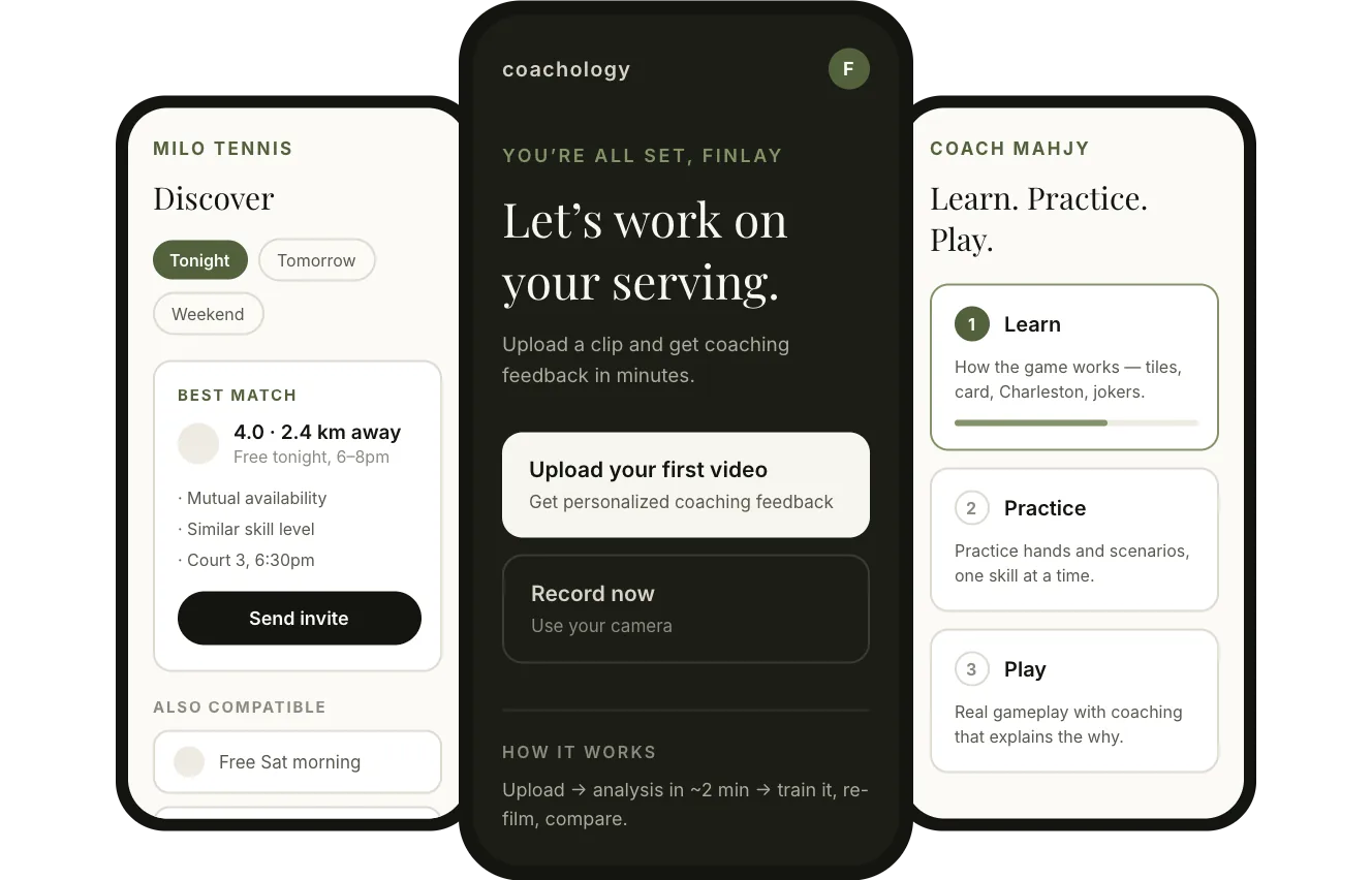
Coachology · Milo Tennis · Coach Mahjy Structure diagrams, not screenshots
Approach
Good products reduce confusion.
I think about products through a simple framework: get people in, help them understand, make it easy to take action, and give them a reason to come back.
- 01
Enter
How does someone get started?
- 02
Understand
Do they know what to do next?
- 03
Act
Can they complete the core task easily?
- 04
Return
Is there a reason to come back?
Onboarding
The first few minutes matter a lot.
Good onboarding gets context without making the user feel like they’re filling out paperwork. Every answer changes what the first screen says.
Less friction. More progress.
- 01 Name What should I call you?
- 02 Sport Six to choose from, or see all.
- 03 Role The fork — shown above.
- 04 Persona Changes shape per lane.
- 05 Focus Writes the first dashboard.
Coachology · flow diagram
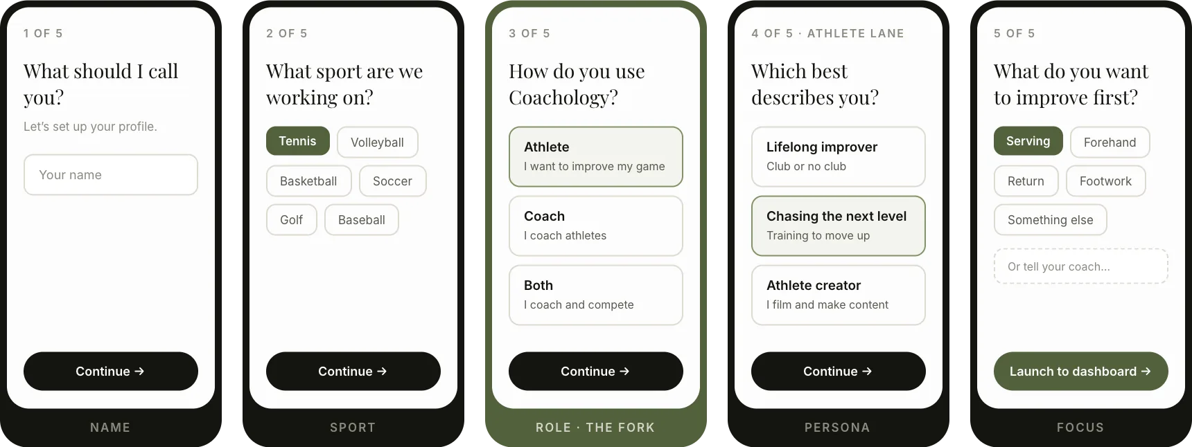
Screens 1–3 are the same for everyone. The role answer is the fork — screens 4 and 5 change shape for athletes and coaches, and the first dashboard writes itself from screen 5.
Core action
The core action should feel obvious.
For Coachology the core action is simple: upload a clip, say what you want help with, and get feedback you can act on. Everything else on the screen serves that.
Coachology · flow diagram
-
01 · Upload
Upload a clip
5–30 seconds, one skill, landscape.
-
02 · Ask
Say what you need
Quick prompts so nobody stalls on a blank field.
-
03 · Analyze
Pick a coach
Different coaching styles, same clip.
-
04 · Feedback
Act on it
Train it, re-film, compare. That’s the loop.
Dashboard
A dashboard should answer “what now?”
A good dashboard surfaces the right next step, recent activity, and progress without feeling overwhelming.
- The next action stays at the topWhatever else changes, upload and coach are always one tap away.
- The room changes after the first uploadFirst visit sells the why. Every visit after serves the work.
- Teaching content sinks to the bottomIt stays available, it just stops competing with the work.
Clear next steps. More progress.
Welcome back, Finlay.
Pick up where you left off.
Coachology · returning dashboard Structure diagram, not a screenshot
Product architecture
Structure matters inside products too.
A clear structure helps people find what they need and keeps the experience simple as the product grows. For Coach Mahjy the whole app is one sentence: learn it, practise it, play it.
Match the structure to how people think.
Coach Mahjy · structure diagram
Home
-
Stage 1
Learn Understand how the game works.
- Meet the tiles
- Reading your card
- The Charleston
- Jokers and exposures
-
Stage 2
Practice Turn knowledge into decisions.
- Practice hands
- Scenarios
- Passing decisions
- Progress
-
Stage 3
Play Play a real game with coaching.
- Guided gameplay
- Why this move
- Hand direction
- Review
Product work
Different products. Different problems.
Three products, three different first questions — and the same way of working through them.
-

Sports coaching · Product
Coachology
Cleaner onboarding, a video upload flow that asks one useful question, coach feedback, and an athlete dashboard that changes after the first upload.
View project : Coachology -

Tennis · Product
Milo Tennis
Moving a player directory toward a product that actually gets a match scheduled — availability first, then a suggested player and time.
View project : Milo Tennis -

Mahjong · Learning product
Coach Mahjy
A learning product for a genuinely complicated game — sequenced so a beginner can follow it, and coached so they understand why.
View project : Coach Mahjy
Principles
The things I care about most.
None of these are clever. They are just the things that keep getting products used.
- 01
Clear first action
One obvious thing to do, visible without scrolling.
- 02
Strong information hierarchy
The most important thing looks like the most important thing.
- 03
Fewer unnecessary steps
Ask for context when it changes something, not before.
- 04
Useful feedback after actions
Something happened, here is what it means, here is what’s next.
- 05
Mobile-first behavior
Designed for a phone screen and a thumb, not a demo laptop.
- 06
A reason to come back
Progress, a result waiting, or an obvious next rep.
Product thinking
Ideas are easy. Product decisions are harder.
The goal is not to add more features. It is to make the important ones easier to understand and use.
It is a loop, not a line. What you learn from feedback changes the core action, not just the interface.
- 01
Problem
What is actually going wrong, in plain language.
- 02
User
Who has it, and what they already know when they arrive.
- 03
Core action
The one thing the product exists to make easy. Everything else serves it.
- 04
Flow
The shortest honest path from arriving to done.
- 05
Interface
What the screen has to say for that path to feel obvious.
- 06
Feedback
What people did, where they stopped, and what they asked for.
- 07
Iterate
Back to the problem, now with better information.
Point of view
Clear beats impressive more often than people think.
None of these are wrong on their own. They just tend to get worked on before the things that decide whether the product gets used.
- Less time onCounting features
- Less time onDashboards that look busy
- Less time onAnimation for its own sake
- Less time onShipping everything at once
- Less time onClever UX nobody understands
More time on the first action, the next step, and the reason to come back.
Writing
Thinking about products.
- Shopify How to set up a Shopify store from scratch Read article
- Shopify The best Shopify apps for small stores Read article
- Category guide The best athletic jewelry brands in 2026 Read article
- Search Shopify SEO that actually moves rankings Read article
Let's talk
Want to talk products?
Apps, onboarding, product flows, dashboards, feature priorities, or the weird idea you’ve been thinking about for six months.
Happy to chat.